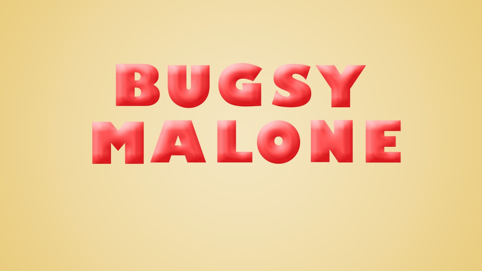
This task was all about playing about with different fonts. For Bugsy Malone, I used the ice-cream effect, which I think worked really well here because it is quite a playful font and very child-like which fits into the theme of Bugsy Malone so well.
I used the colours red and yellowish because they are colours which come up quite a lot in the film and on the cover of Bugsy Malone, the yellow-ish colour is one of the main colours on the posters and covers etc.
No comments:
Post a Comment