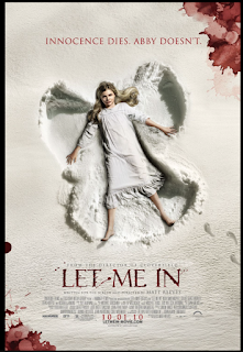
Colours: white symbolise that she’s an angel and that she’s good. Red symbolises death, pain and danger.
Red splashes in corner to symbolis death and blood.
She’s dressed in white to symbolise that she’s innocent.
Footsteps as if she’s fallen/given up.
“Innocent dies. Abby doesn’t” suggesting that she possibly turns bad.
Background is like paper. Blood on it, suggesting that it stains.
The film poster I chose was “let me in”. The first thing that drew me to this poster was that it is mostly white and there is only a few splatters of red. I think the white background symbolises good and it gives off a heavenly effect. The heavenly effect is also tied in where the actress has made an angel mark in the ground and how the girl is dressed in one white robe is portraying her as an angel.
The other colour which stands out to me is red. I think that the red symbolises death and danger because the word death is used in the slogan. I like how the background looks a little like paper as well because it’s basically suggesting that the bad is there to stay where the blood is staining the paper.
Following this, I also think that the slogan is suggesting that the main character may turn bad because it’s as if the innocent is a different person in a way and Abby is a new person who isn’t all good.
Finally, there are footsteps leading up to where the actress has made a snow angel in the ground. I think that this could suggest that lady had either fallen into it or given up on something and just fallen into the angel dip in a way.
There are many ways posters target their audiences, one of these is by the font type used. If the poster is promoting a children's film the film would be quite big and bold whereas if the poster was promoting an adults horror film the font would be quite sharp and thin (like the one above). Another way would be by the colours they use, if the colours are quite dull this could be targeted to an older audience as the film itself might be based on an older time whereas if the colours were quite bright the film might be based in now.
Posters are used to promote film or TV by letting people know what programmes or films are coming out, the days and times and also to try and get people to like the film or programme before they've even watched it by using interesting images and fonts etc.
By Chloe Chapman.
 This poster is based on the film "Red", hence why the colour of the poster is red. i have also put gun shots through the page as well as red is a violent film with loads of guns and action.
 This poster is based on the film "Flubber". I have tired to make it look like the poster is actually flubber by painting it green and having darker bits of green on it to make it look like the bubbles that are inside flubber.

